
Xkreen – Digital Signage CMS Platform with AI-Powered Audience Analytics
ROLE
UI/UX Designer
UX Research
Branding
DELIVERABLES
Brand Identity, UX/UI Design, CMS Platform & Front-End Development
Xkreen is a modern SaaS platform that simplifies digital signage management for businesses of all sizes. Designed to transform TVs and commercial displays into powerful communication tools, the platform enables users to remotely manage screens, playlists, schedules, menus, promotions, and digital content through an intuitive cloud-based CMS.
The vision behind Xkreen was to remove the complexity typically associated with enterprise digital signage solutions by delivering a user-friendly experience that is accessible to both technical and non-technical users. Every aspect of the product was designed around simplicity, scalability, and ease of use while maintaining the flexibility required to support growing screen networks.
For this project, I led the entire creative and product design process, from building the brand identity to designing and developing the digital experience. My responsibilities included branding, logo design, visual identity, UX strategy, UI design, copywriting, front-end development, and the design of the CMS platform.
The project was divided into two primary experiences:
- The public-facing marketing website, designed to communicate the platform’s value proposition and drive conversions.
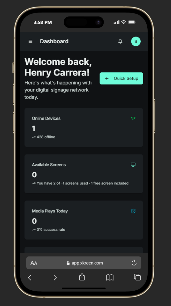
- The cloud-based CMS dashboard, designed to simplify content management, playlist creation, scheduling, and screen administration.
TOOLS: Figma, Adobe Illustrator, Lyssna, Maze, Gemini, Adobe Photoshop, Vercel
UI/UX DESIGN
Branding & Visual Identity
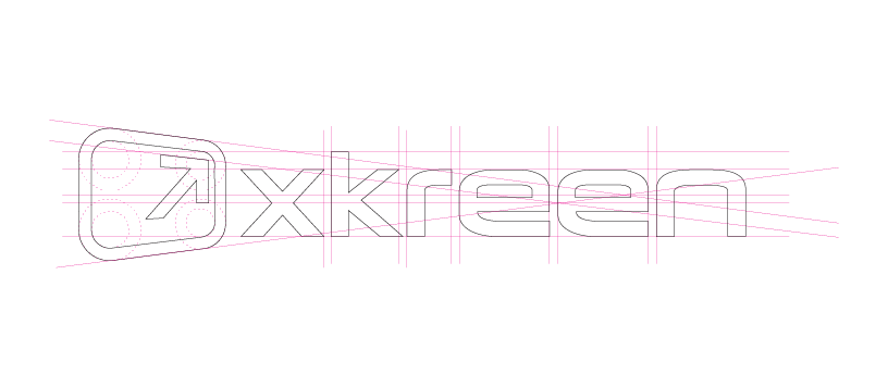
I created the complete visual identity for Xkreen from the ground up, establishing a modern technology brand that communicates innovation, simplicity, and reliability.
The identity was designed to be clean, recognizable, and scalable across digital products, marketing materials, presentations, and the CMS interface. Every visual element was created to reinforce Xkreen’s positioning as a modern SaaS platform while maintaining consistency across every customer touchpoint.
The branding process included:
- Logo design
- Brand identity system
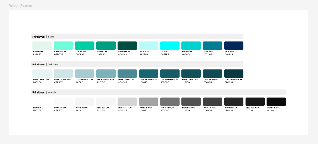
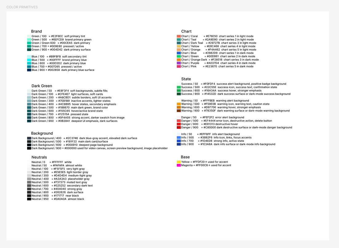
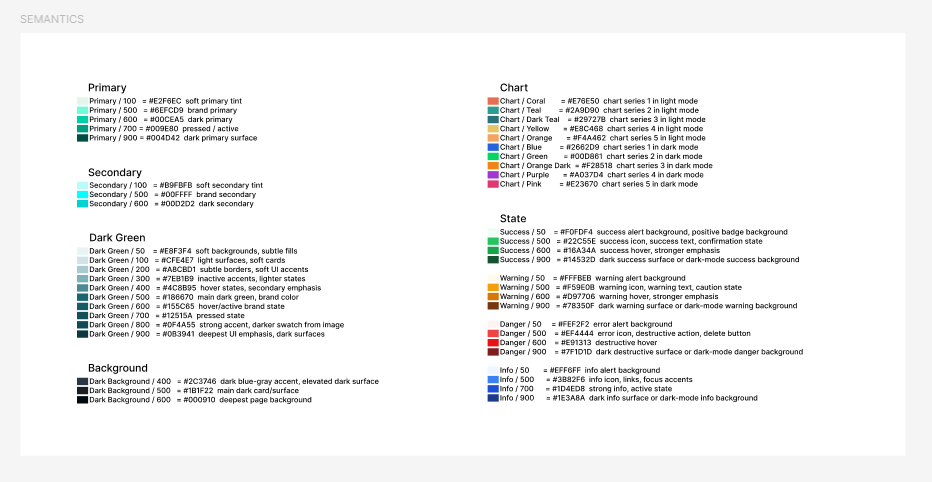
- Color palette
- Typography selection
- Iconography
- Visual language
- Marketing assets
- Design system foundation

Research & Analysis
Understanding Digital Signage Management and SaaS Usability
To better understand how businesses manage digital signage and where users experience difficulty, I conducted a survey focused on current workflows, technical confidence, content management habits, and expectations for a digital signage SaaS platform.
The survey included business owners, marketing teams, restaurant managers, retail staff, property managers, and other professionals responsible for managing digital displays.
The responses helped identify recurring usability challenges, workflow inefficiencies, and expectations around screen management, content publishing, scheduling, and platform simplicity.
The survey is intended for business owners, marketing teams, restaurant managers, retail staff, property managers, and anyone responsible for updating digital displays.
UX Pain Points Identified
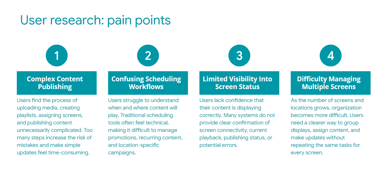
Analysis of the survey responses and discovery research revealed several recurring pain points:
- Digital signage platforms feel overly technical and intimidating for non-technical users
- Managing multiple screens and playlists often requires too many steps
- Complex dashboards create cognitive overload and slow down workflows
- Content scheduling and publishing are frequently confusing or fragmented
- Many systems rely heavily on proprietary hardware or complicated setup processes
- Interfaces prioritize functionality over usability and visual clarity
- Screen management lacks intuitive organization for multi-location businesses
- Updating promotions or menu content can be time-consuming and inefficient
- Existing platforms often feel outdated and visually inconsistent
- Users struggle to quickly understand device status, playlist assignments, and publishing workflows
- Navigation structures are frequently cluttered, making key actions harder to access
- Small businesses need enterprise-level control without enterprise-level complexity
Problem Statement
Businesses and organizations that rely on digital signage often struggle with platforms that are overly technical, difficult to manage, and expensive to scale. Existing solutions typically prioritize complex enterprise functionality over usability, creating friction for small businesses, restaurants, retailers, and non-technical teams trying to manage screens, playlists, promotions, and content updates efficiently.
Many users need a simpler way to control multiple displays remotely without dealing with confusing dashboards, fragmented workflows, or hardware-heavy ecosystems. A modern solution is needed that transforms digital signage management into an intuitive, accessible, and scalable experience, allowing businesses to update content quickly, manage screens effortlessly, and maintain brand consistency across locations.
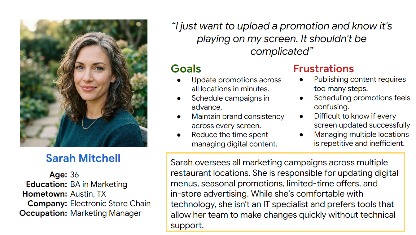
User Personas
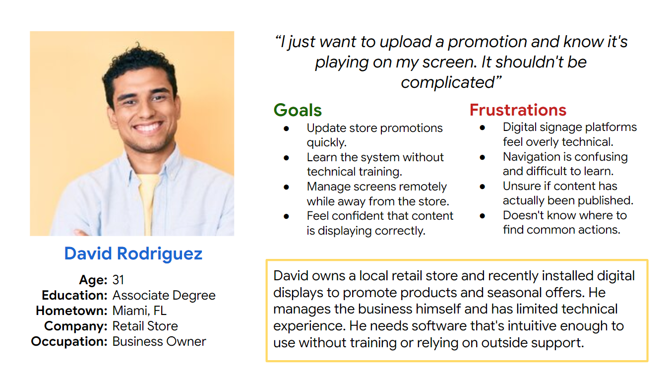
Based on the survey responses, user research, and recurring usability patterns identified during the discovery phase, I developed two primary personas representing Xkreen’s main customer segments: businesses managing multiple locations and smaller businesses looking for a simpler digital signage solution.
These personas helped guide decisions around navigation, dashboard organization, content publishing workflows, screen management, and the level of technical complexity exposed throughout the platform.
User Flow
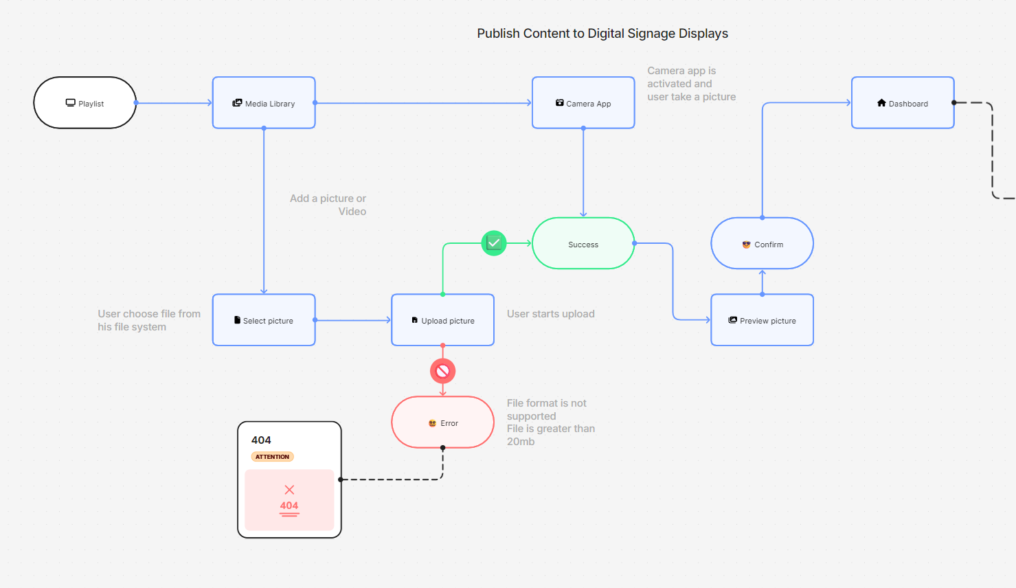
The workflow was designed to reduce friction between content creation and deployment. Rather than forcing users to navigate multiple disconnected sections, the process follows a logical progression from uploading media to publishing content on selected displays.
The flow minimizes decision points, provides confirmation before publishing, and gives users immediate feedback on screen status, increasing confidence that content has been deployed successfully.
Ideation & Wireframing
Dashboard Architecture: Modular Workspace
The ideation phase focused on simplifying the way users interact with digital signage content by breaking complex workflows into clear, manageable steps. Early sketches explored multiple navigation patterns, dashboard layouts, and content management flows before evolving into low-fidelity wireframes.
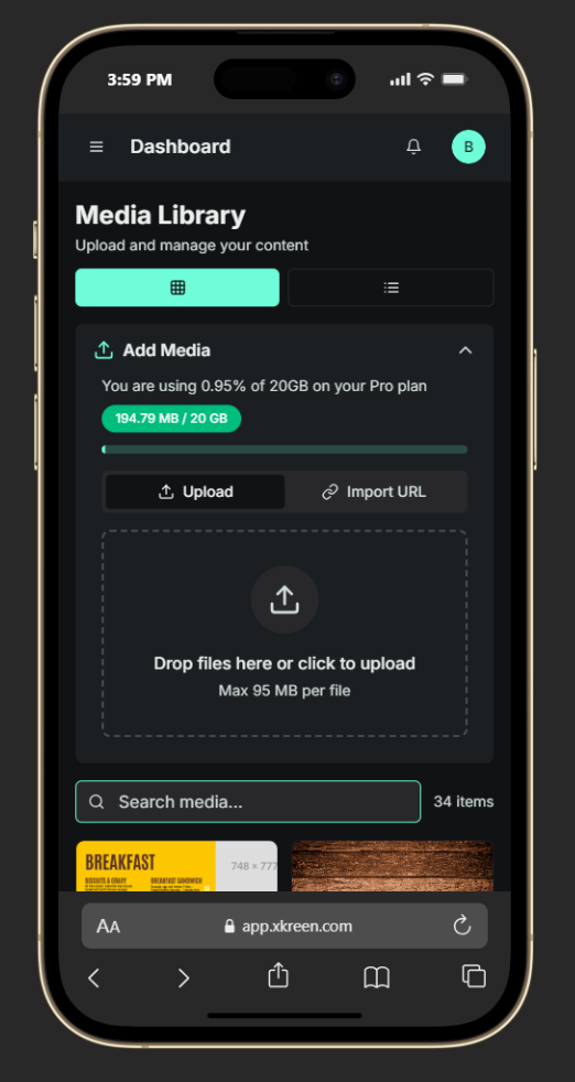
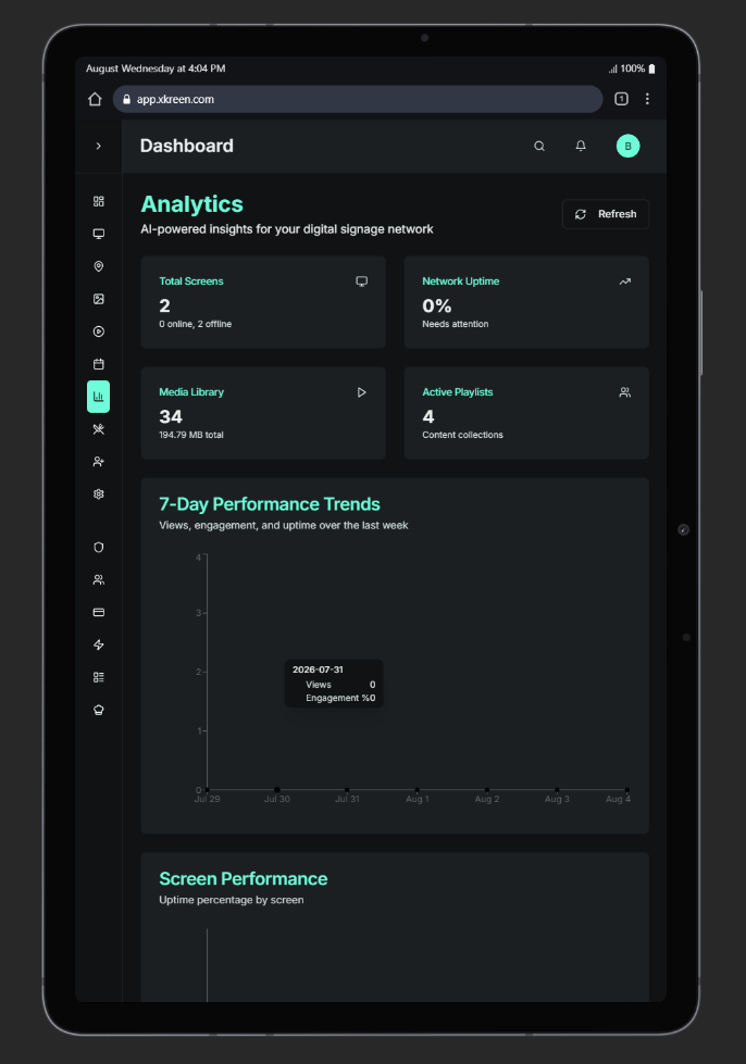
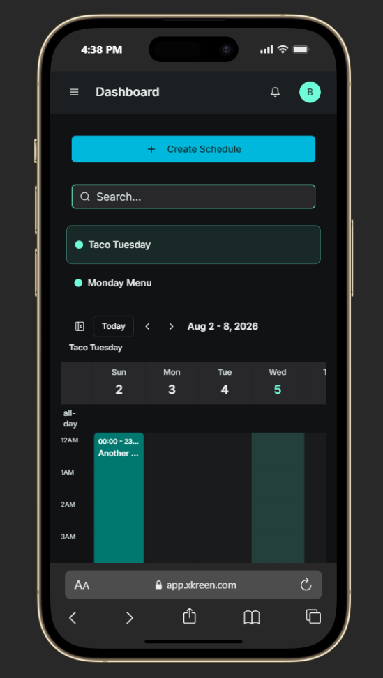
Rather than designing around technical system architecture, the experience was built around users’ most common tasks, uploading media, creating playlists, scheduling content, and managing displays. The result is a modular workspace where each section serves a specific purpose while remaining visually connected through a consistent layout and component system.
The dashboard was intentionally designed to reduce cognitive load by surfacing only the most relevant information at each stage of the workflow.
Wireframing Process
Low-fidelity wireframes were created to validate the overall information architecture before moving into visual design. This stage focused exclusively on structure, usability, and workflow efficiency, allowing rapid iteration without being influenced by branding or visual styling.
The wireframes explored:
- Dashboard hierarchy and navigation
- Media Library organization
- Playlist creation workflows
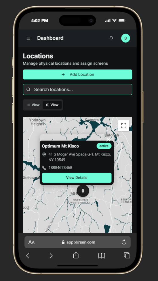
- Screen and location management
- Scheduling interactions
- Content publishing flow
- Administrative tools
- Responsive desktop layouts
Each iteration refined how users move through the platform while minimizing clicks and reducing unnecessary complexity.
Design Principles
Task-Oriented Navigation
The navigation was organized around user goals rather than system functions, allowing users to quickly access the tools they use most frequently.
Modular Components
Each workspace, including Media Library, Playlists, Screens, Locations, and Schedules, was designed as a reusable module following the same interaction patterns. This consistency reduces the learning curve and makes the interface easier to scale as new features are introduced.
Progressive Disclosure
Advanced settings and administrative functions remain accessible without overwhelming first-time users. The interface presents only the information needed for the current task while allowing deeper configuration when required.
Visual Hierarchy
Information is organized using clear spacing, typography, and grouping to help users quickly distinguish primary actions, secondary controls, and supporting information. This improves scanability and reduces decision fatigue during everyday content management.
Accessibility Considerations
Clear Navigation Structure
A persistent sidebar and consistent page layouts help users quickly understand where they are within the platform while reducing navigation errors.
Large Interactive Areas
Buttons, cards, and upload zones were designed with generous spacing to improve usability across different devices and support users with varying levels of technical experience.
Consistent Interaction Patterns
Reusable interface components maintain predictable behaviors throughout the CMS, helping users build familiarity and confidence as they navigate different sections.
Responsive Workspace
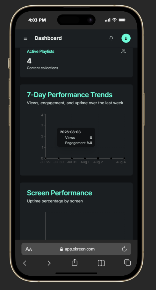
Although primarily designed for desktop management, the layout follows responsive principles, allowing essential administrative tasks to remain accessible on tablets and smaller screens.
Design System
Iconography
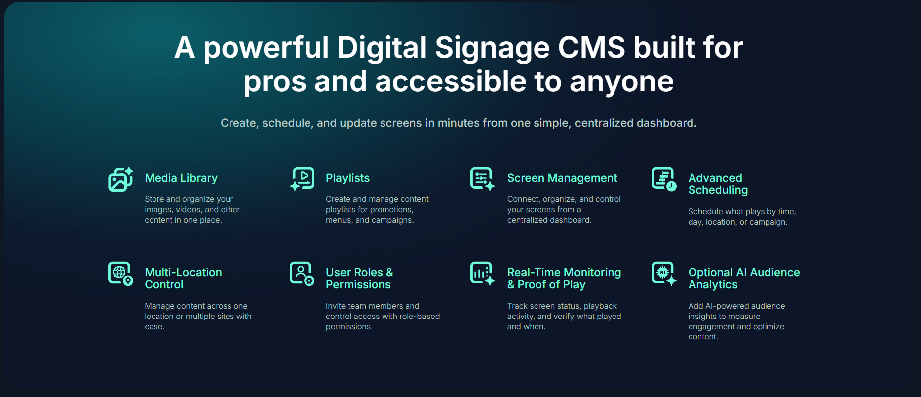
I designed a custom iconography system specifically for Xkreen, creating a cohesive visual language that supports both the marketing website and the CMS platform. The icon set represents the platform’s core features, including screen management, media libraries, playlists, scheduling, AI capabilities, audience analytics, user management, and content publishing, as well as the insights generated through computer vision, such as demographics, attention, dwell time, emotions, and audience behavior.
Each icon was designed with a clean, geometric style using rounded corners, consistent stroke weights, and the brand’s signature gradient palette. The result is a scalable icon system that improves navigation, simplifies complex concepts, and reinforces Xkreen’s modern, technology-driven identity across every touchpoint.


Typography
- Primary Typeface: Inter
- Designed for digital-first experiences and UI applications.
- Strong readability across desktop and mobile devices.
- Clear visual hierarchy through consistent font sizes and weights.
- Optimized for dashboards, forms, tables, and navigation.
- Accessible spacing and contrast to improve long-term usability.
- Consistent typography system shared across the website and CMS.
Type Scale
| Style | Usage |
|---|---|
| Display | Hero sections and marketing headlines |
| H1 | Page titles |
| H2 | Section headings |
| H3 | Card titles and widget headers |
| Body Large | Feature descriptions and introductory copy |
| Body | Standard interface content |
| Small | Labels, helper text, and metadata |
| Caption | Timestamps, file sizes, and secondary information |
The typography system works together with the design system to create a clean, modern interface that feels approachable while supporting the fast-paced workflows of content managers, marketers, and business
Card Design System
Modular, Responsive & Data-Centric
As part of the Parent Literacy Dashboard interface, I designed a flexible card component system that adapts seamlessly across desktop and mobile breakpoints. These cards function as self-contained units to present key literacy insights, such as time spent, units completed, and progress messages, in a way that is clean, scannable, and visually engaging.
Visual Design & Prototyping
In Figma, I created high-fidelity mockups and an interactive prototype. The interface balances data and emotion, offering a calm, celebratory aesthetic with clear CTA buttons, friendly language, and emotional touchpoints like badges and confetti animations for milestones.
Accessibility was carefully considered with high contrast colors, scalable text, and support for screen readers.
Outcome
Xkreen transformed a complex digital signage workflow into a modern, intuitive, and scalable SaaS experience. From branding and UX strategy to UI design and front-end development, I created a cohesive product that simplifies content management while making enterprise-level functionality accessible to businesses of all sizes.
The final solution provides a clean, modular CMS that enables users to manage screens, playlists, schedules, and digital content with confidence. Built on a scalable design system, the platform establishes a strong foundation for future features while delivering a consistent experience across both the marketing website and the CMS.